Hollis & Rye
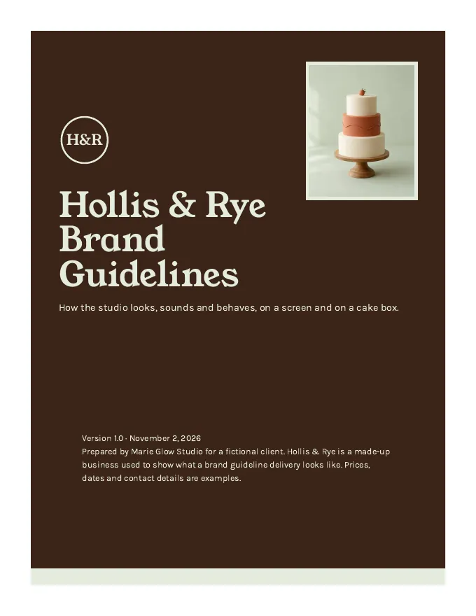
A made-up custom cake studio. Nothing here is a real client, and the photos are AI-generated.
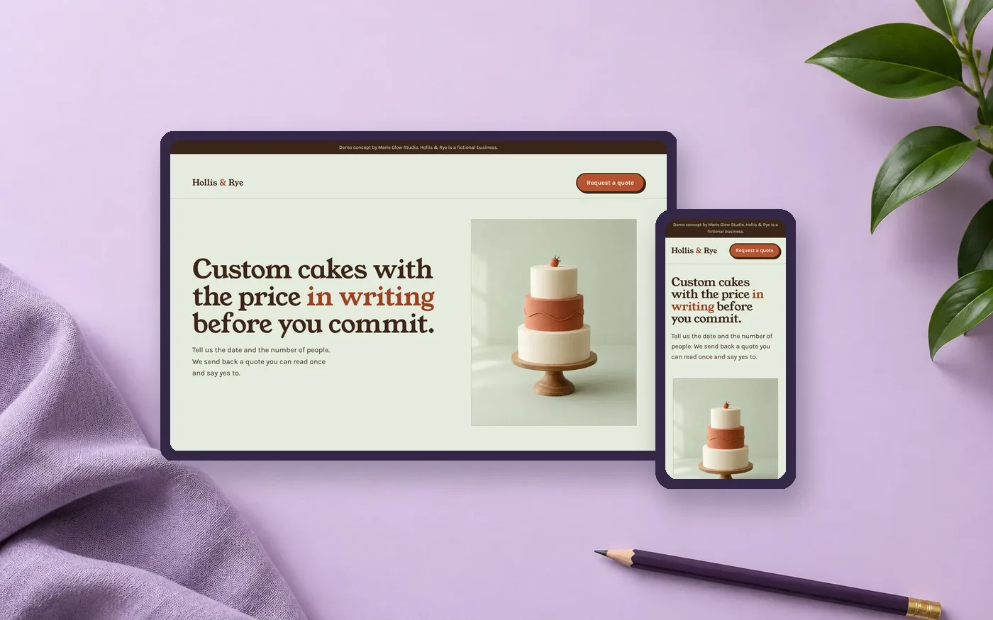
Hollis & Rye is a made-up custom cake studio. I researched real bakery sites first, wrote the words before the design, then built it twice, once like my $249 Website Starter and once like my $1,497 Complete package.
A made-up custom cake studio. Nothing here is a real client, and the photos are AI-generated.
A one-page Starter, and a Complete site with a 3D scroll home, a cake builder, a 3D cake you design and a booking calendar with order tracking.
Five real bakery sites, read first. No search volume data.
Accessibility checks, contrast, keyboard, 320 pixel width and reduced motion in Chrome. Not real screen readers, Safari, Firefox or phones.
Custom cake studios are often run by the person who decorates. The people ordering are planning a birthday, a wedding or a work event, and they need three answers before they commit: what it costs, whether the date works, and what to do next.
In the five independent bakery sites I read, lead times ran from 2 to 3 days at one shop to 2 to 6 months for weddings at another, and deposits ranged from $25 or $50 to a $100 non-refundable deposit to full payment at order. Those are single data points from each bakery’s own pages, not an industry standard.
Across those five sites, here is what I found when I looked at the first screen and the ordering path:
That became the brief for the demo: put the button on the first screen, say the price, and answer the date question honestly.
I analyzed five real bakery sites for messaging, navigation, calls to action, ordering flow and trust signals, and read search results for the questions customers ask. The first pass used a text-only tool that could not judge typography or photography, so I took real browser screenshots of all five at desktop and phone size.
Limits: I did not use keyword volume data, so there are no search volume claims here. Two sites could not be reviewed (one returned an error and one loaded only its navigation), and the customer objections are inferred from bakery policy pages, not from interviews.
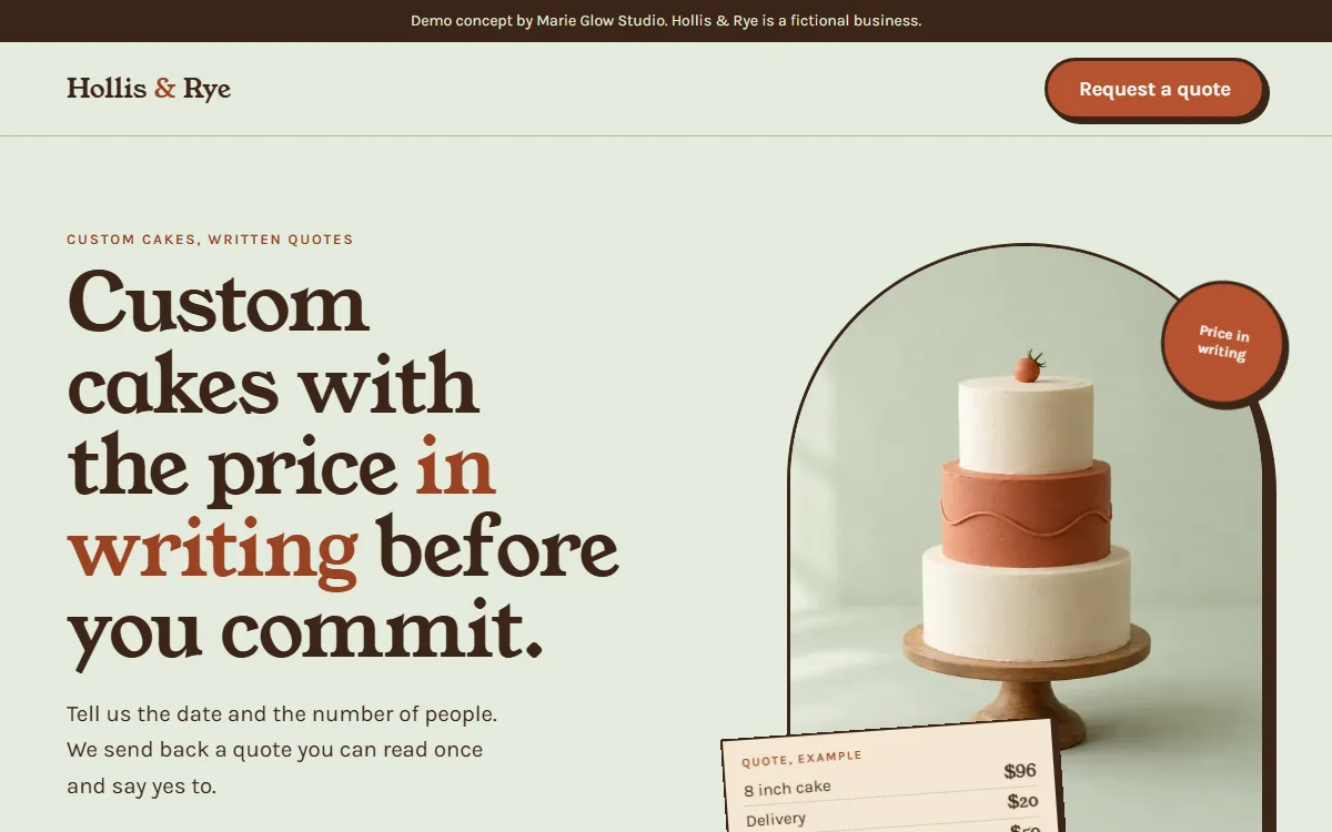
The copy came first, in a fixed order: promise, problem, proof, button, bridge, ask, button, with the same button words both times (“Request a quote”). The proof is a sample quote with made-up prices that says so, because there are no real reviews to quote.
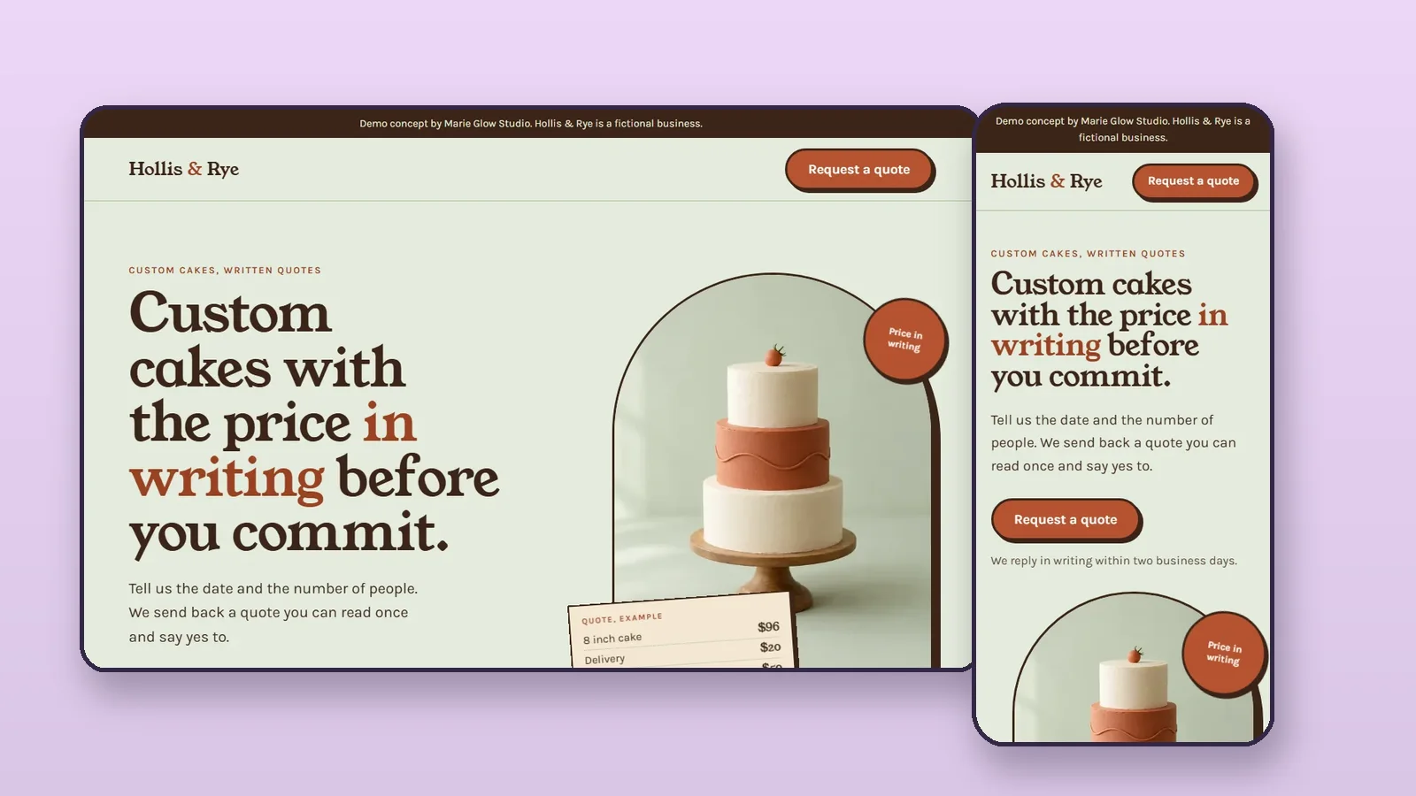
What the $249 Website Starter includes (from my pricing page): a mobile-friendly one-page site in your brand colors, fonts, logo, photos and copy, basic on-page SEO, a contact section with social links, and a link or embed to your own booking tool, quote form, phone number or buy button. Not included: e-commerce, custom photography or copywriting, unlimited revisions. In this demo the quote button goes to a placeholder page that sends nothing.
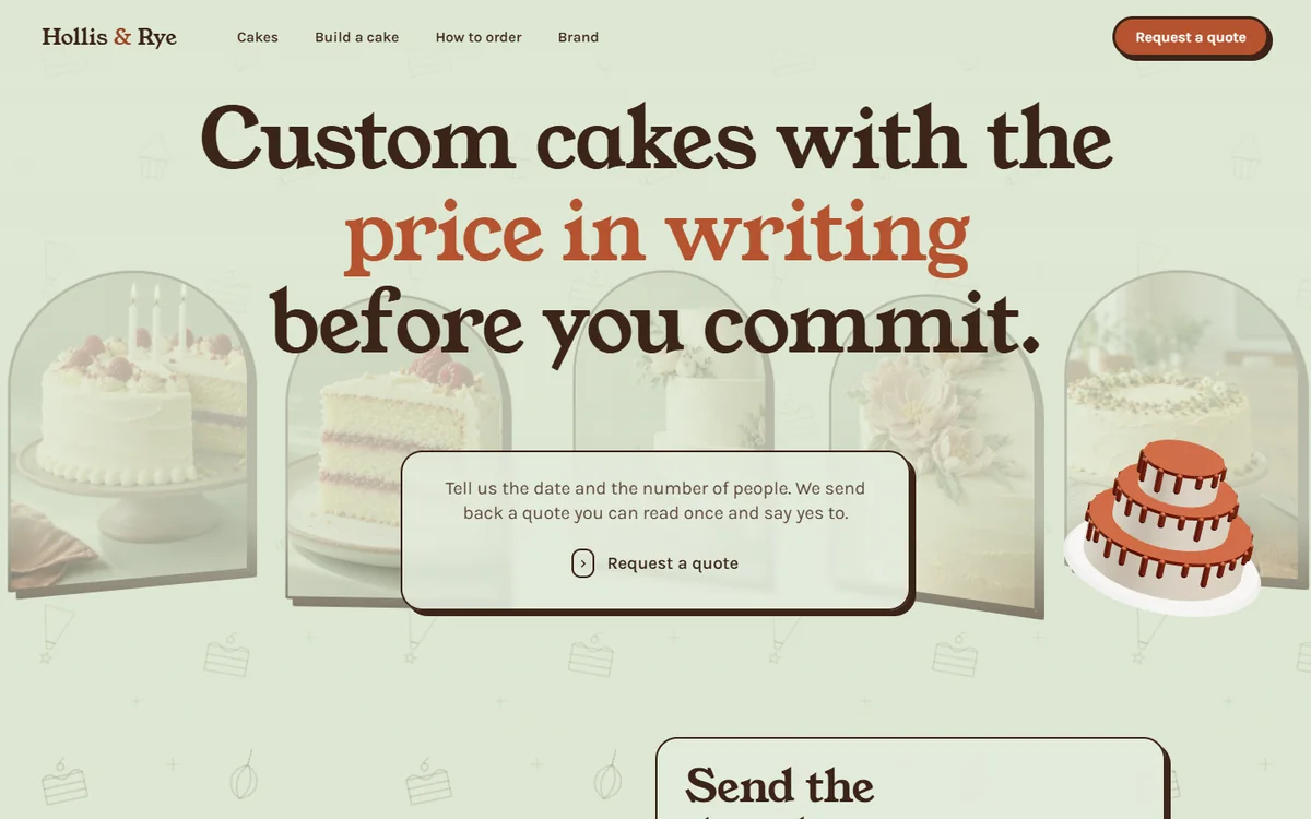
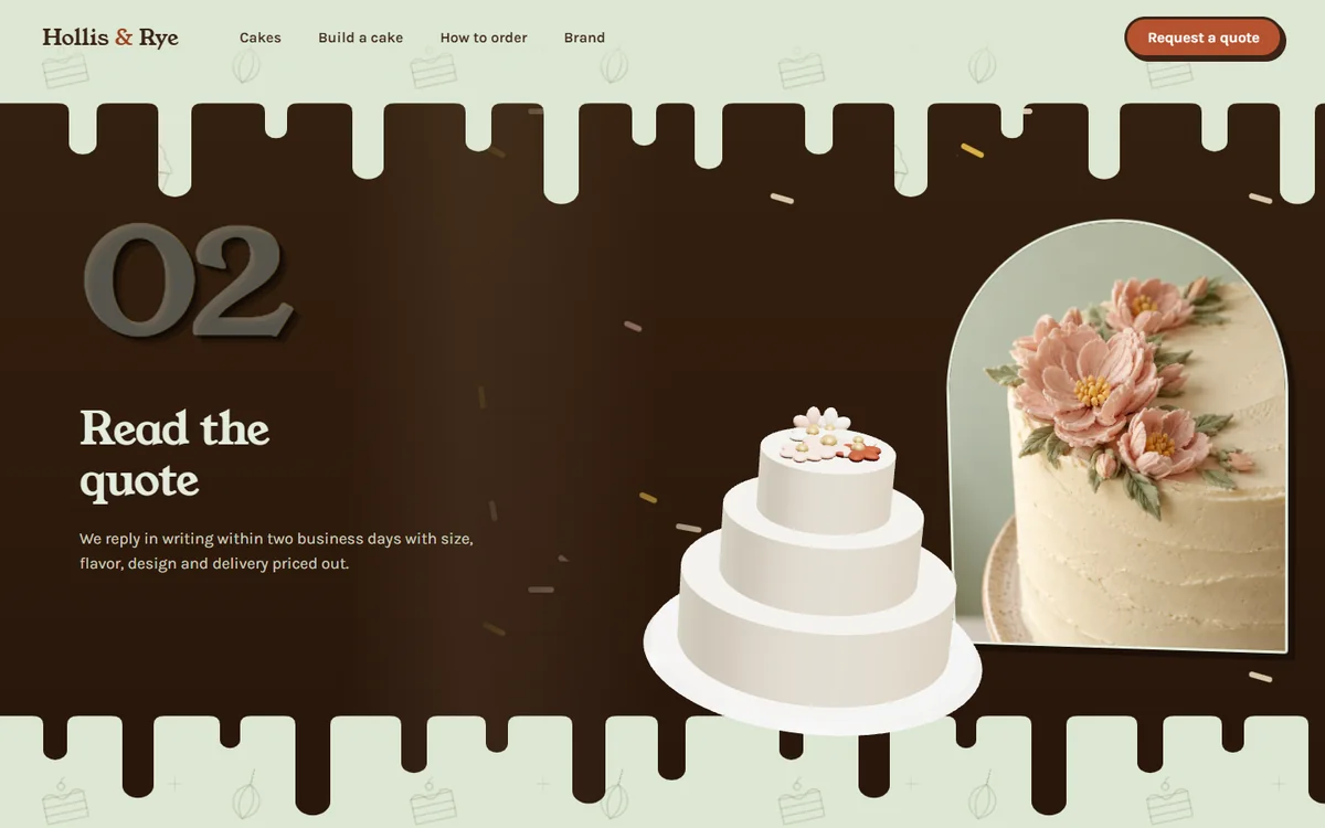
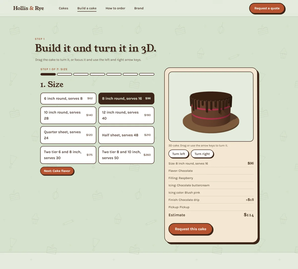
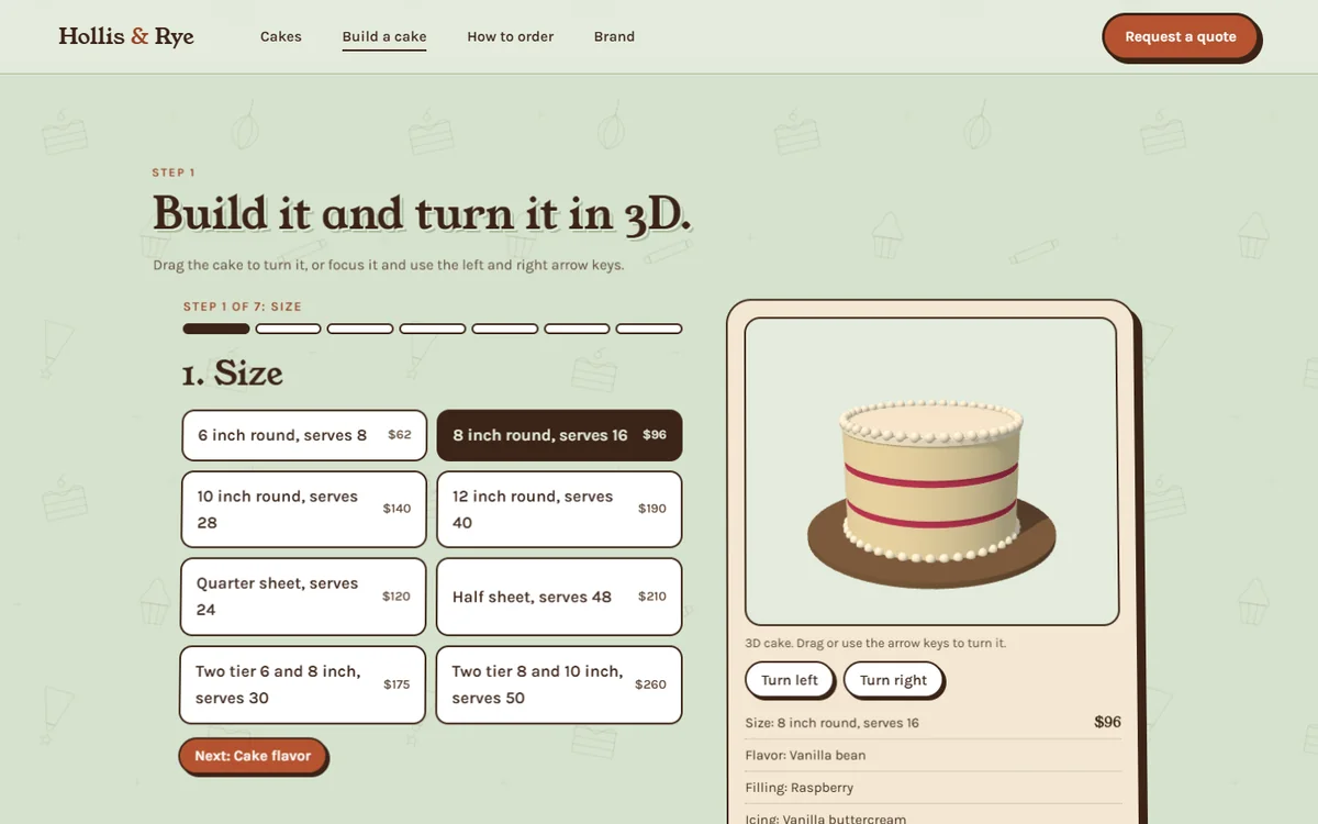
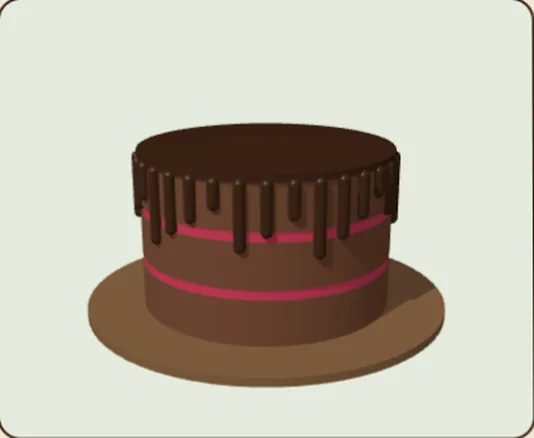
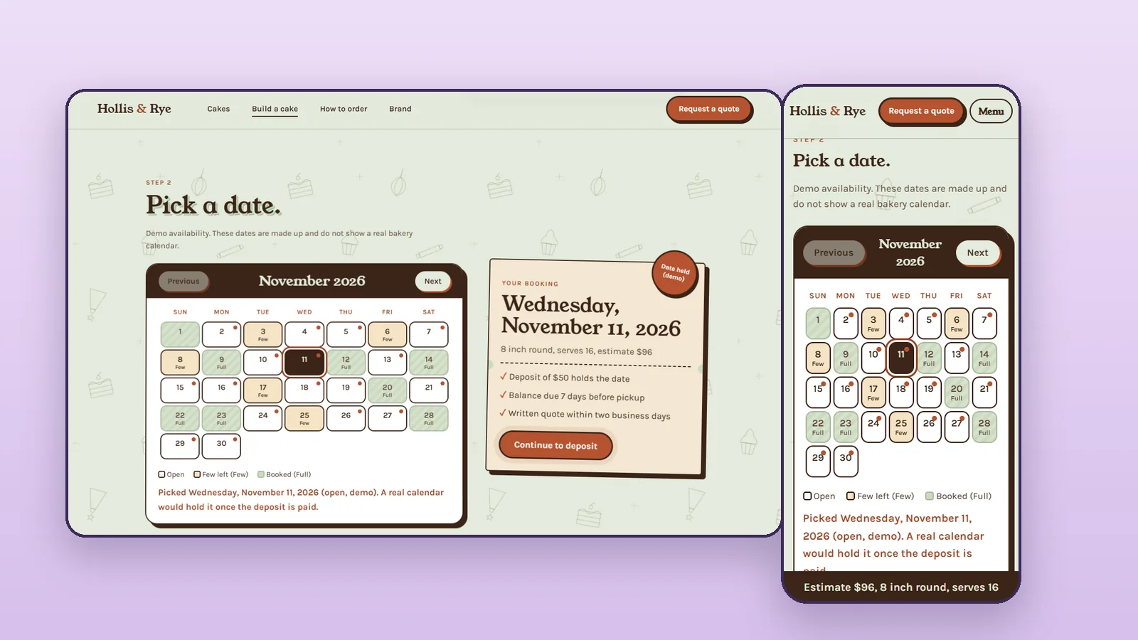
The larger version adds a 3D scroll home page, a Cakes page, a Build a cake page, a Design in 3D page with booking, a How to order page with lead times and policies, a brand style guide page and a request page. The builder lets you pick a size, flavor, filling and finish and see an estimate, then carry your choices to the request page through the web address.
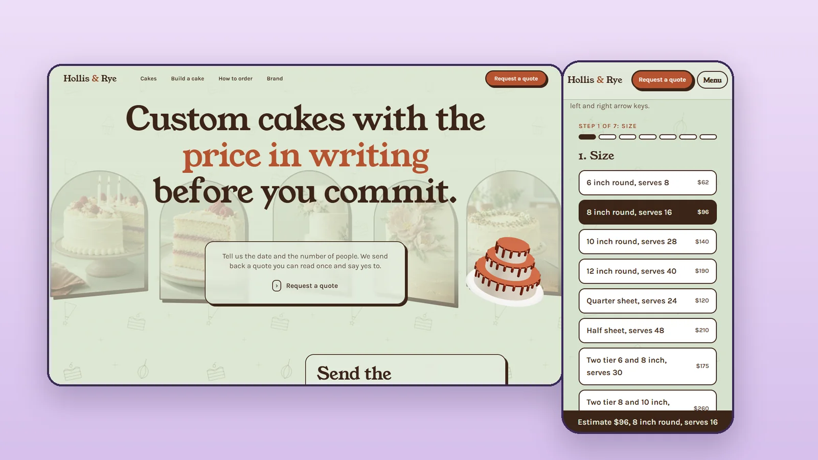
Scope check: the cake builder, the scroll-driven 3D home page, the 3D cake design and the booking calendar with deposits and order tracking are all part of the $1,497 package, built together with the rest of the site. A payment system built from scratch would be quoted separately.
Open the full site demo · Read the brand guideline · Download the 20-page PDF
| Feature | Starter, $249 | Complete, $1,497 |
|---|---|---|
| Shown here as | One page plus a placeholder quote page | Full site, brand guideline, builder, 3D scroll home, 3D design and booking |
| Brand | Uses the client’s colors, fonts and logo | Custom logo, colors, fonts, style guide, social graphics, as listed on my package page |
| Interactive features | A button to the client’s own quote tool | Cake builder with an estimate, a scroll-driven 3D home page, a 3D cake you design, a booking calendar with a deposit look and order tracking, all included |
| Price | $249 | $1,497 |
| Payments | None | None in the demo. A real build connects your own payment provider. |
The approved copy decided the layout, so the page reads promise, problem, proof, ask.
I compared an editorial, a bold and a minimal direction and chose the editorial layout with the bold direction’s button. I also caught myself writing headlines that were not in the approved copy and put the approved words back.
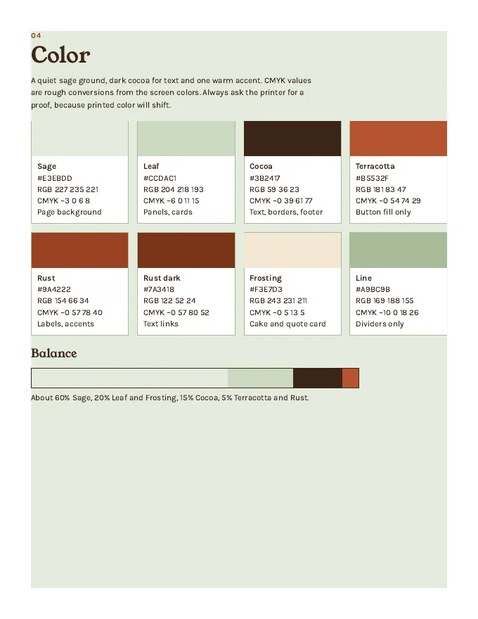
A warm cream is the default “tasteful” look, so I tried blush, apricot, sage and lilac. Sage passed and goes with the terracotta button.
The button text is white on terracotta at 4.95 to 1, which passes with little room. Terracotta as text on the sage background fails, so it is a button fill only.
The sample quote lines appear one by one like a receipt printing, because the promise is the price in writing. Everything stops for visitors who ask for reduced motion.
The quote lines are visible by default. A script marks the card once it scrolls into view, and the style only hides the lines when motion is allowed and JavaScript is on, so nothing can stay invisible.
@media(prefers-reduced-motion:no-preference){
  .js .quote div{opacity:0;transform:translateY(6px);transition:opacity 250ms,transform 250ms}
  .js .quote.in div{opacity:1;transform:none}
}
(function(){var q=document.querySelector('.quote');if(!q)return;
if(!('IntersectionObserver' in window)||q.getBoundingClientRect().top<innerHeight*0.85){q.classList.add('in');return;}
window.addEventListener('beforeprint',function(){q.classList.add('in');});
var io=new IntersectionObserver(function(es){es.forEach(function(e){if(e.isIntersecting){q.classList.add('in');io.disconnect();}});},{rootMargin:'0px 0px -15% 0px'});io.observe(q);})();One known limit: a tool that captures the page without scrolling shows an empty card there. The notes in the project say so, and printing forces the lines visible.
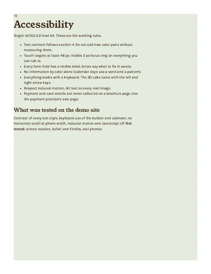
Tested in Chrome: automated accessibility checks (0 violations at the end, on every page at desktop and phone size), text contrast on every text style, keyboard use, 320 pixel width, text spacing, reduced motion and JavaScript off. Not tested: real screen readers, Safari, Firefox, real phones and slow connections. This is not a certification of accessibility.
The walkthrough video for this build is not published yet. When it is, it will be here with chapters. It covers the research, the copy, the code and the mistakes.
I can build a one-page Website Starter or a full Complete Website and Brand Identity package for a product or service business. See more of my real work, or read about how web design works here.
Hollis & Rye
The case study, itemized
Read 1 of 6 chapters